The effects of climate change are there for all to see: melting mountain and polar glaciers, rising sea temperatures, extreme weather events and so on. As a result, it’s not surprising that for several years, climate change has become a clarion call in the media. Every day, data and graphs are presented as experts simplify complex topics, such as the growth of renewable energy in electricity production and its link to the decarbonisation required to halt global warming.
This is the context that has given rise to Renewable Rhythms, an art project that combines data visualization and artificial intelligence to express the renewable energy evolution.
Explore the Data PaintingVisual and aural languages are used to translate energy transition into a galaxy of dots and sounds in perpetual motion, representing renewable sources – which produces the electricity in our homes – and their impact on consumption.
A work of this kind involves a network of professional and technical contributors that starts at data collection and ends with the user’s experience. Daniele Giannini, an IT professional at Terna since 2021, embarked on this journey utilizing the data provided by Italy's electricity transmission system operator, in collaboration with the The “What If” Project team. They are a collective of generative artists brought together by Giannini to explore modern technologies as a medium for creating digital art experiences. Through the Transparency Report, the Terna4Green platform and the website interactive dashboards, Terna makes its data available to everyone, allowing representations to be developed for a range of purposes, up to and including artistic research.
Art is indeed a powerful medium for raising awareness of climate change and the ongoing efforts to mitigate its effects
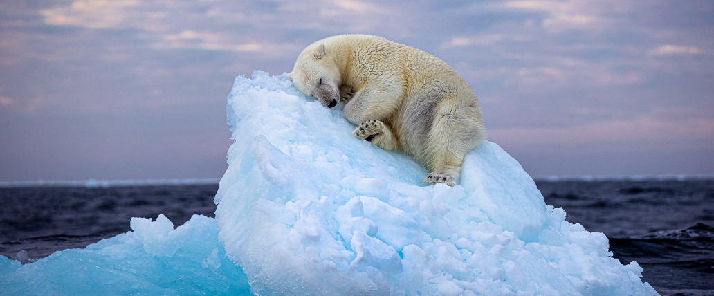
Think of Ice Bed, the latest shot by photographer Nima Sarikhani winner of the People's Choice Award. The picture shows a bear sleeping on a small iceberg in the middle of the sea. All around it... only water. Sarikhani has managed to capture the devastating consequences of climate change through a single photograph. Art has again simplified and made accessible the complexity of our increasingly information and number-saturated world.
In their essay “Communicating with Data”, Francesco Tissoni and Mara Pometti state that data visualization allows users to “immerse themselves in a fully data-driven multimedia experience”, where content is organised under a visual hierarchy designed at the data writing stage.
Data is then collected and manipulated like organic matter to create something new.
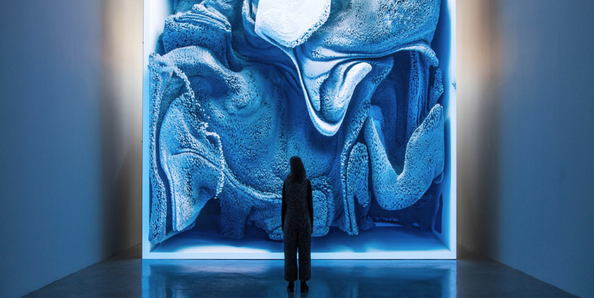
It is not surprising, then, that as the world learns about the implications of big data, many artists have started to create actual “data-driven” works of art. Refik Anadol is perhaps one of the most well-known: he uses artificial intelligence algorithms to transform data into immersive and dynamic visualizations.
“Melting Memories”, his most significant work, is an installation developed from data on human memory processes. Using sensors that record brain activity, Anadol translates this data into fascinating visual animations on large, high-impact LED screens. Renewable Rhythms aims to have the same impact on its viewers.
The availability of well-structured open data ready to be analysed and transformed is one of the fundamental steps towards a fairer and more democratic society.
This is why Terna makes them available through various macro-projects such as Terna4green or the Transparency Report. In the first case, data is put at the service of the community with the creation of the first dashboard to manage the relationship between electricity production data and CO₂ emissions: a platform to monitor progress towards international decarbonisation targets. The Transparency Report, on the other hand, is the first example of the comprehensive sharing of national electricity system data available in a single digital platform. This is a huge treasury of native Terna data intended not only for electricity operators and market analysts, but also for an ever-growing public.